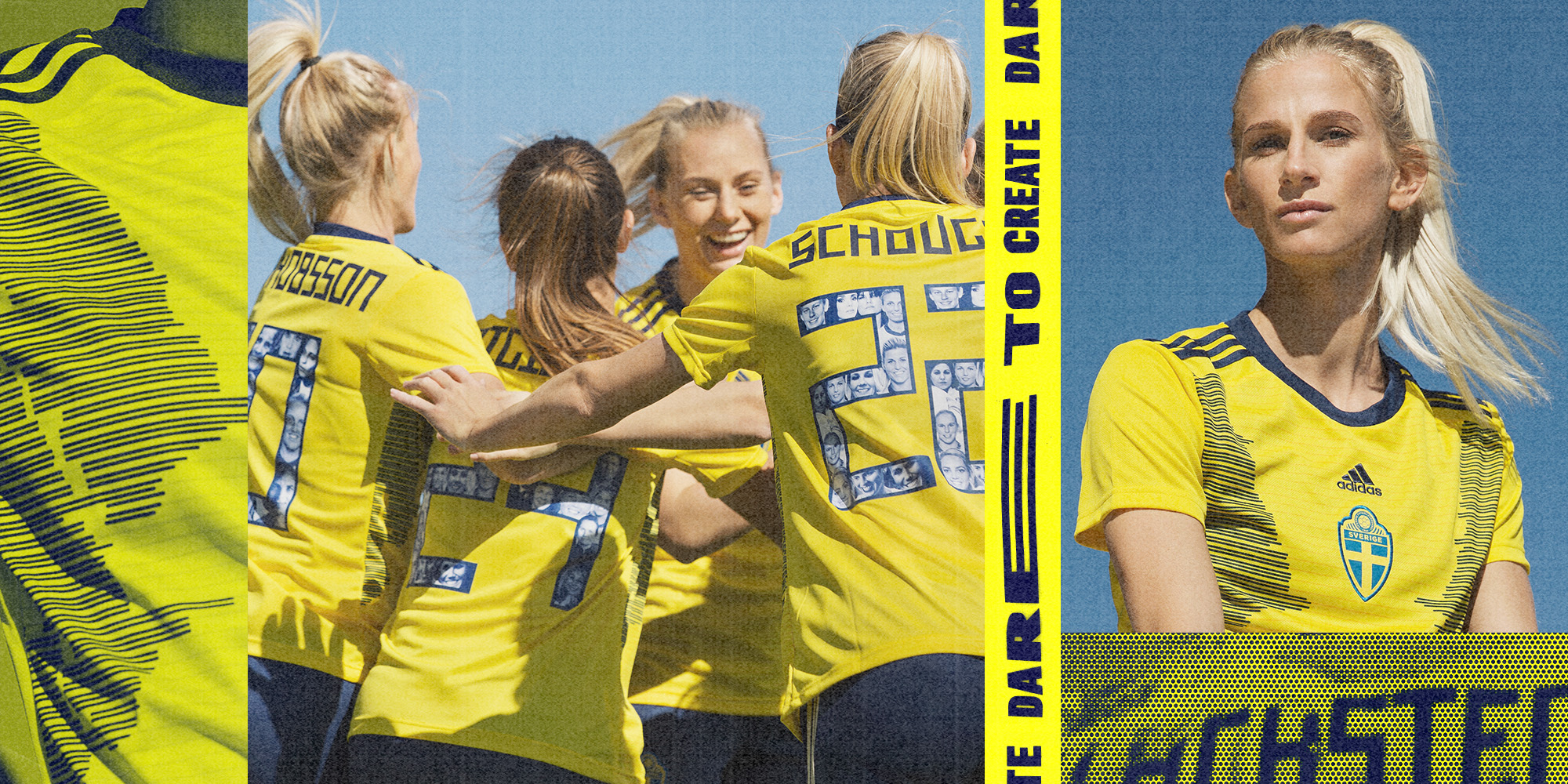
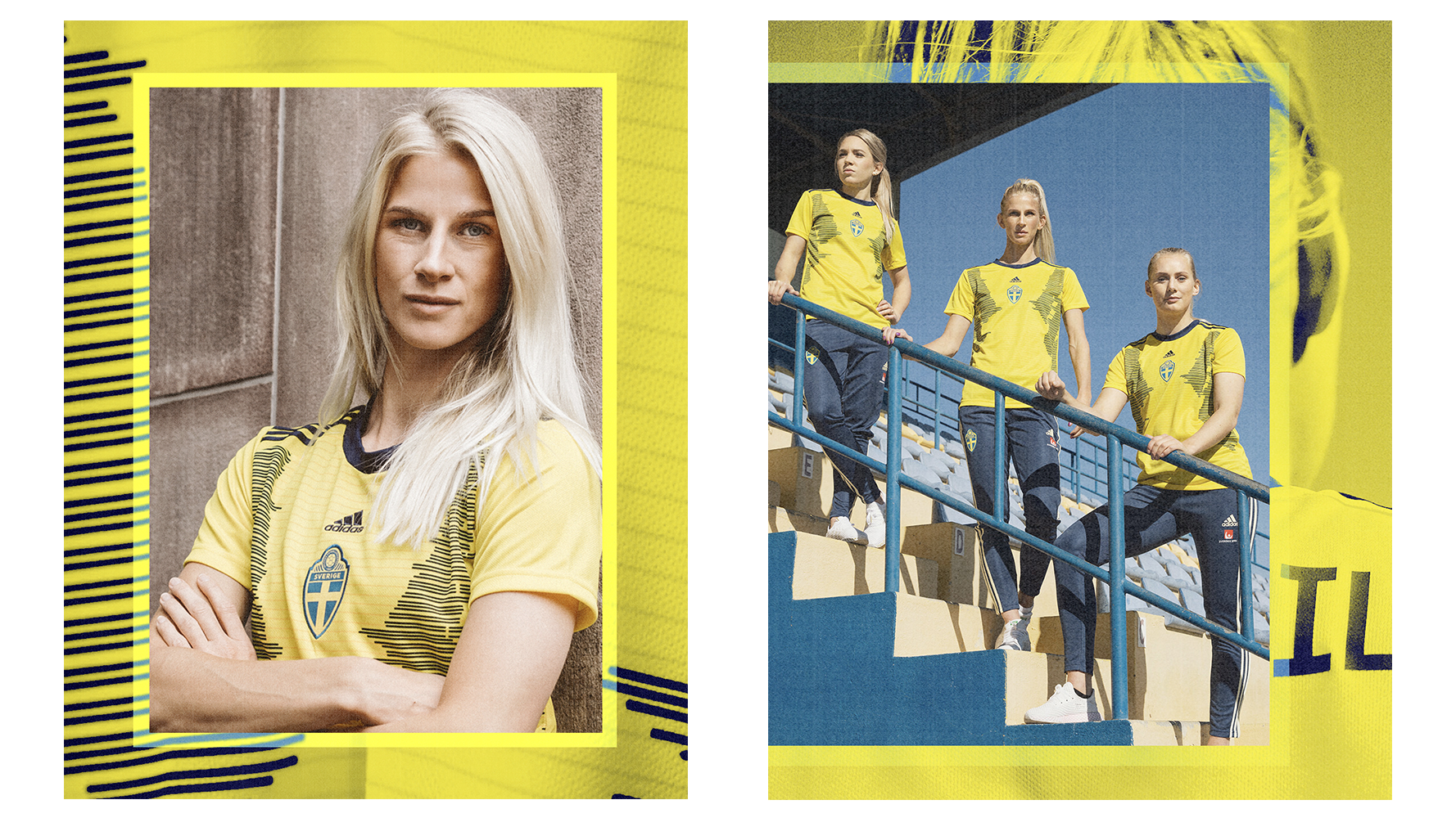
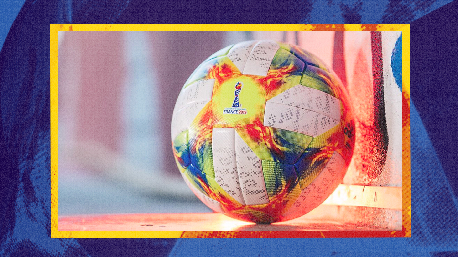
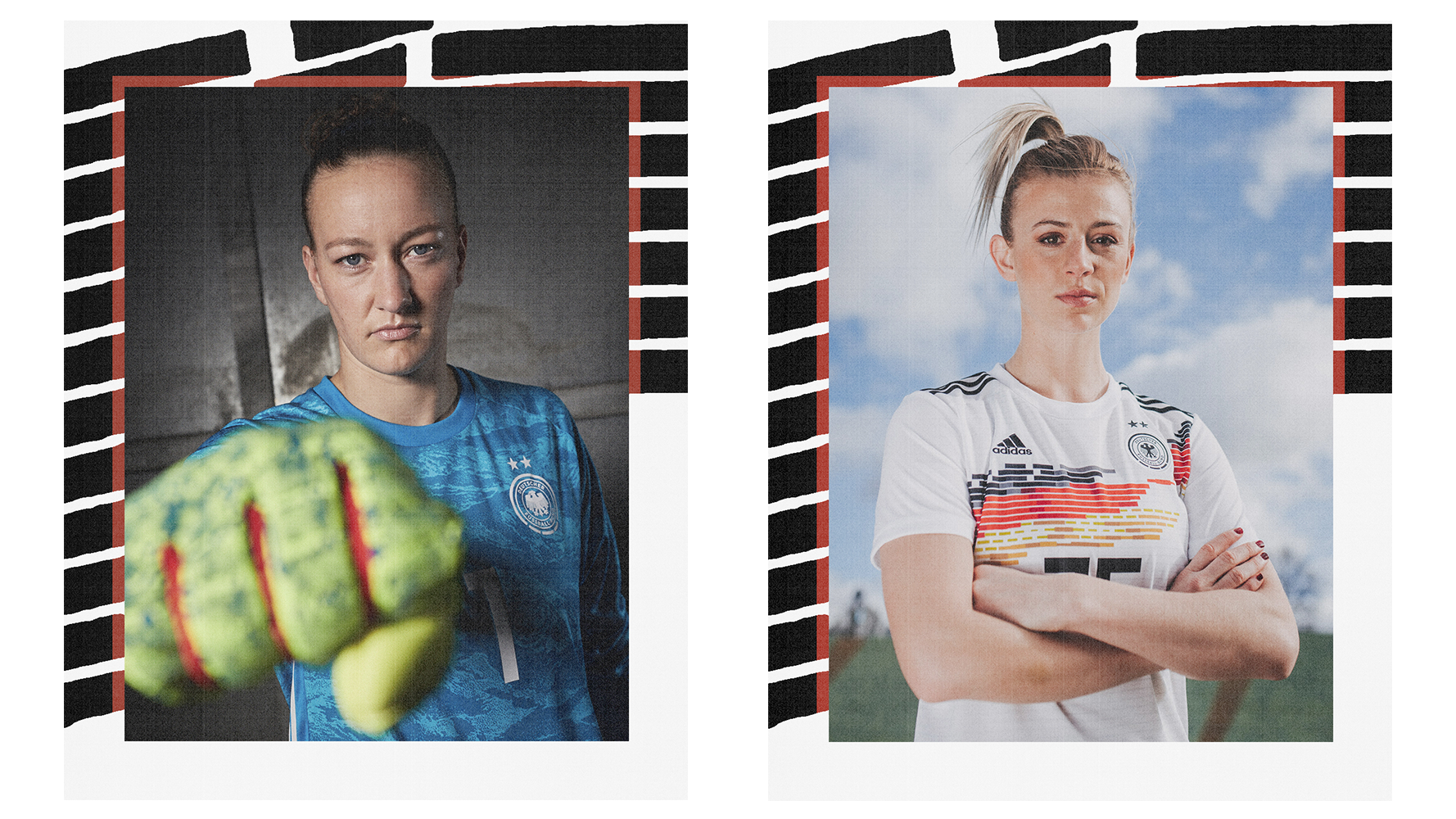
For the Women’s world cup in 2019 I was approached to create a design language for the adidas teams competing in the tournament.
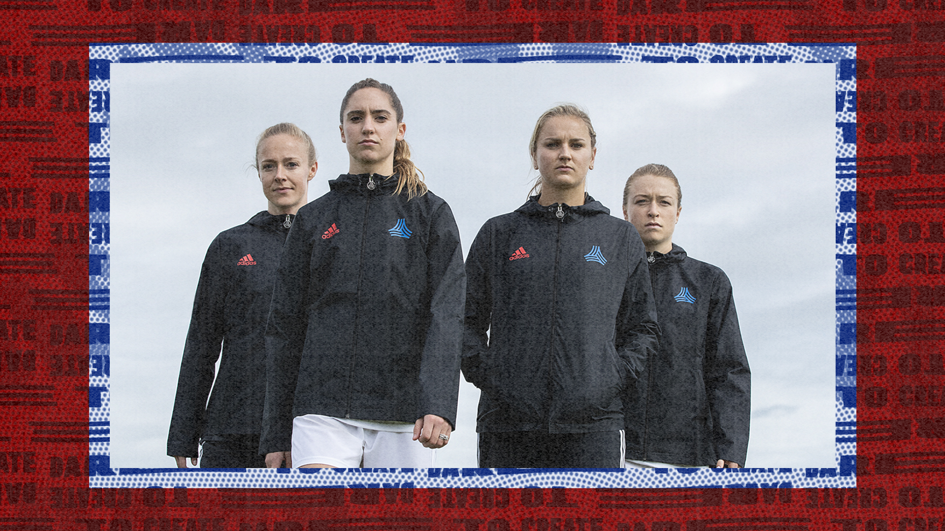
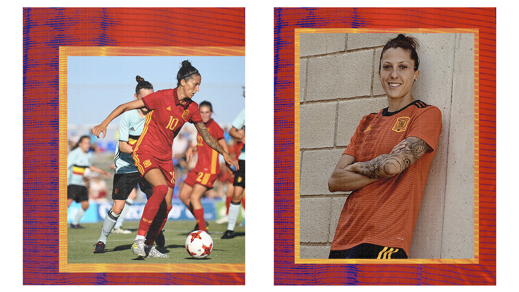
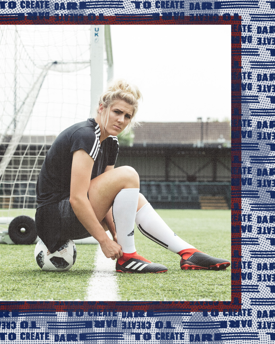
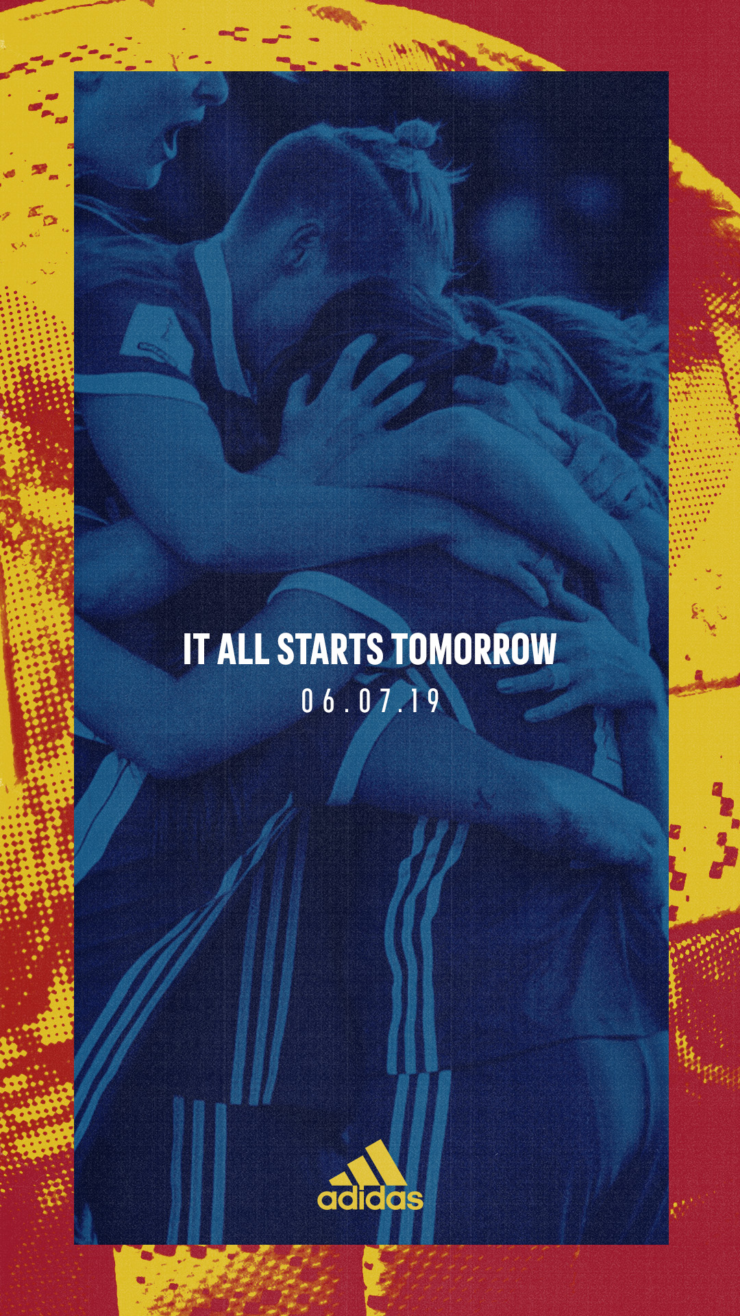
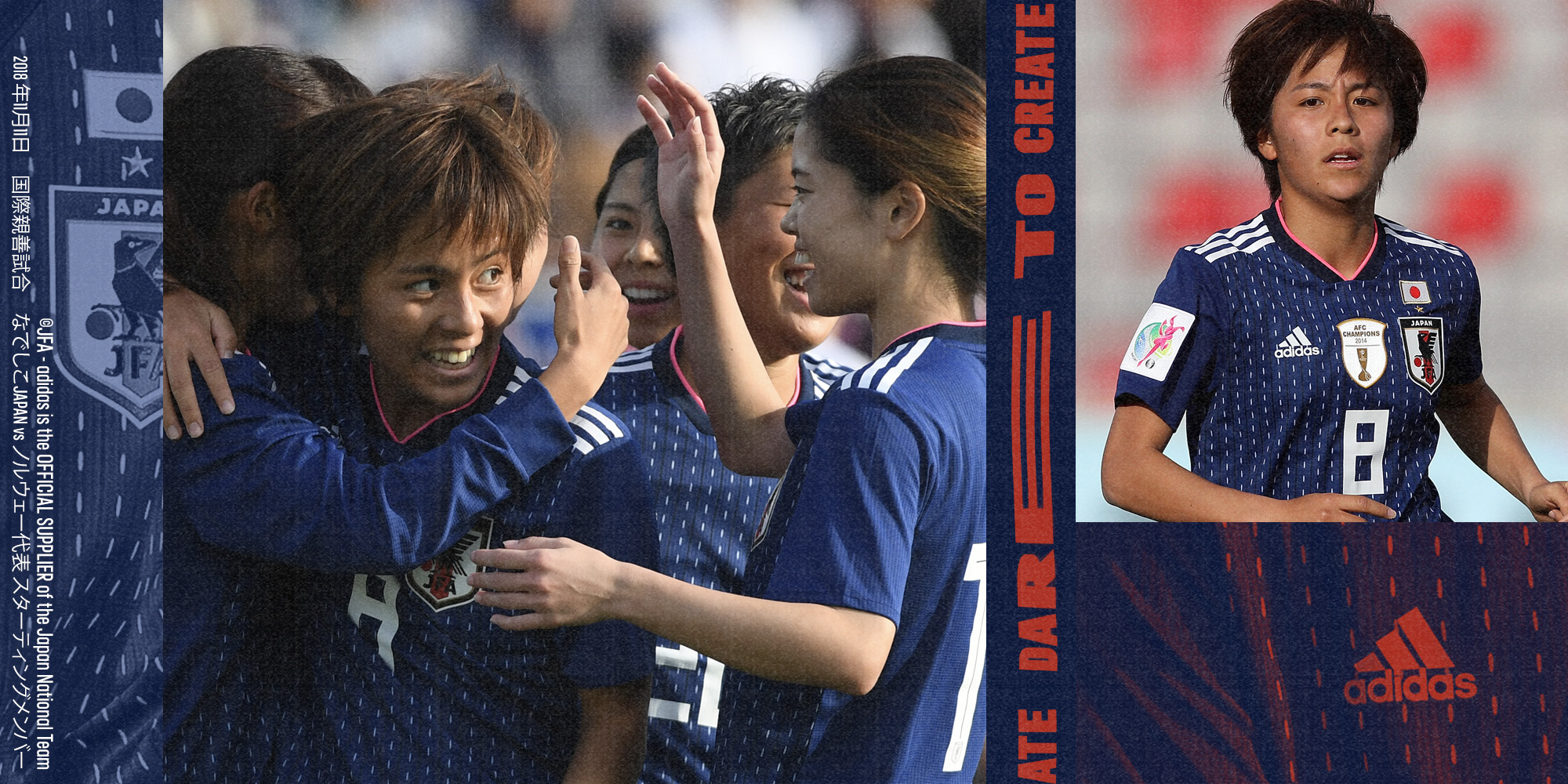
The design language had to flex across all countries and tie in different styles of photography; such as in game to portrait. I came up with a design system using the colours and textures of the kits being played. Two team colours were allocated to each country, forming a system and recognisable and distinctive template for each. I used Gradient maps, bitmaps and paper style effects to create a tactile look and feel.
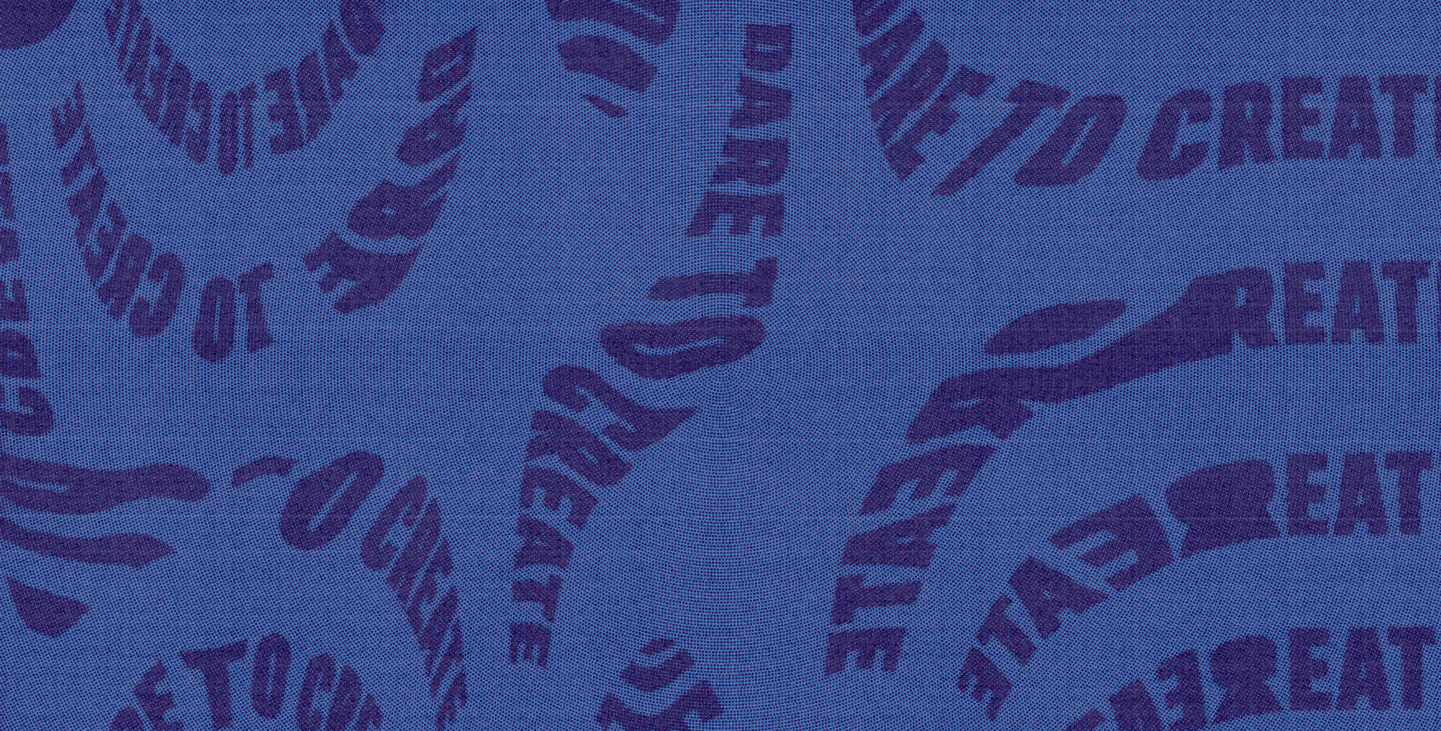
This was a low budget campaign which was viewed on a global perspective. It was viewed heavily across Adidas, team and player social channels. The content produced was reactive. The Dare to create pattern featured in the stadiums as perimeter advertising for the WWC tournaments. The pattern was created by distorting scans of typography on the photocopier and adding texture.



Role: Art Director/ Design Lead
Agency:IRIS Worldwide
Formats: Digital (Web, App, CMS), Social, Retail, Brand guidelines
Shout out to Liam Boreham